

Forward media Business Card Design
Forward Media follows a simplistic design principle that uses repetitive patterning and reflective element with a diagonal divide line as if one were to look through a prism for graphic image treatment. I want the business card to reflect the same bold treatment.


I have made a few concept designs for the back of the card following the same repetitive pattern design principle.

It uses a black and white aesthetic using a prominent logo with an expanding dot as a repetitive pattern. In the fourth panel, the dots are large and off screen, the negative space of the top and bottom for forms an up and forward arrow to represent forward progress of the Forward Media spirit.
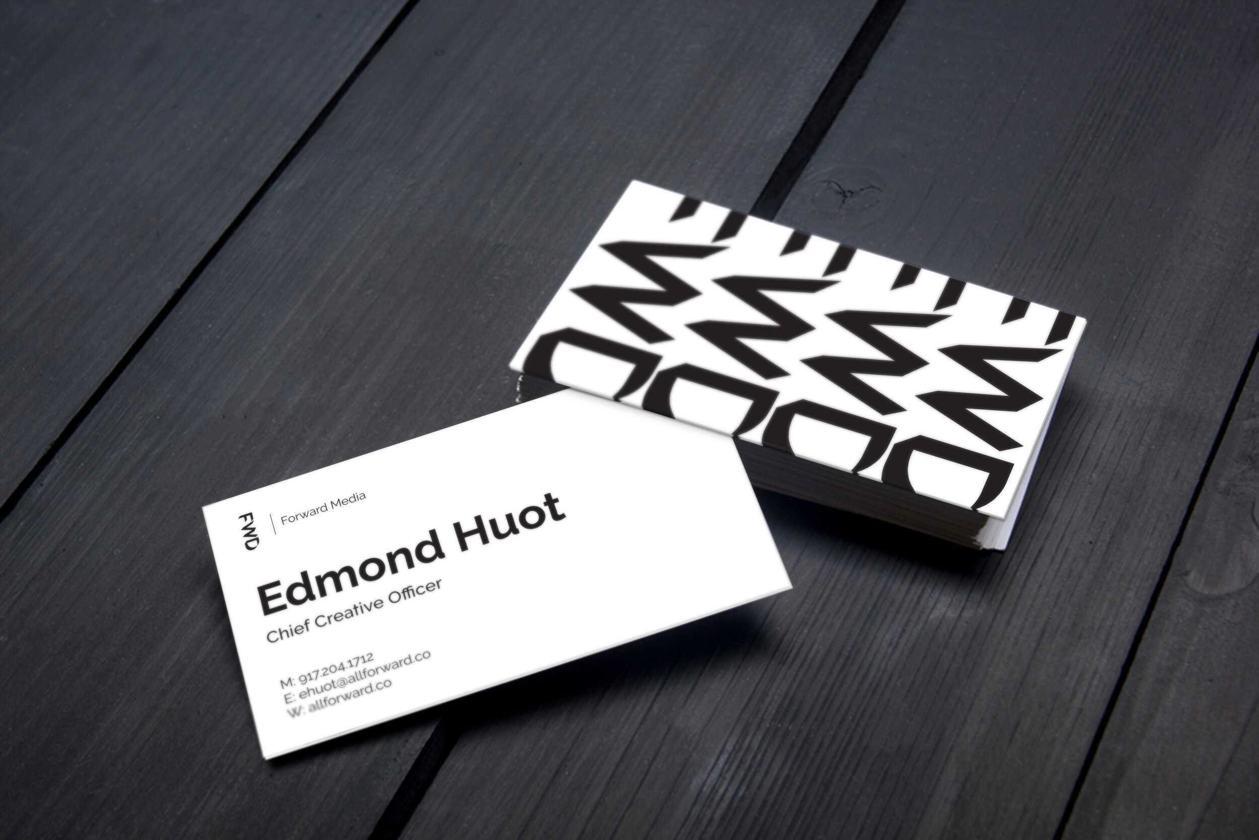

The finalized design use the logo as a simple repetitive element span across the back of the card. The front features a large type for the name to create a level of cheekiness and makes the card instantly recognizable. For Winnipeg and Phoenix offices, one repetitive logo was removed to add in all three cities the company operates to show potential clients the cities the media agency operates in a large Northern America scale. Thanks for reading!